
The Pleasure-Purpose Matrix
A few years ago at Publicis, I was chatting about archetypes with a strategist.
“Check this out,” he said, pulling up a slide with 12 archetypes, each paired with a brand.
“There are Creators, like Apple, and Magicians, like Disney.”
It felt like reading a horoscope: everything made sense, but there was zero data to support it.
The issue wasn't its pseudoscientific vibe.
Strategists need frameworks, but we can do better than sorting brands into predictable categories. This week, I created a model based on data from 300 shoppers. It’s got a stronger quantitative spine, but that’s not the important part.
The Model
You can see the basic concept in the graph below.
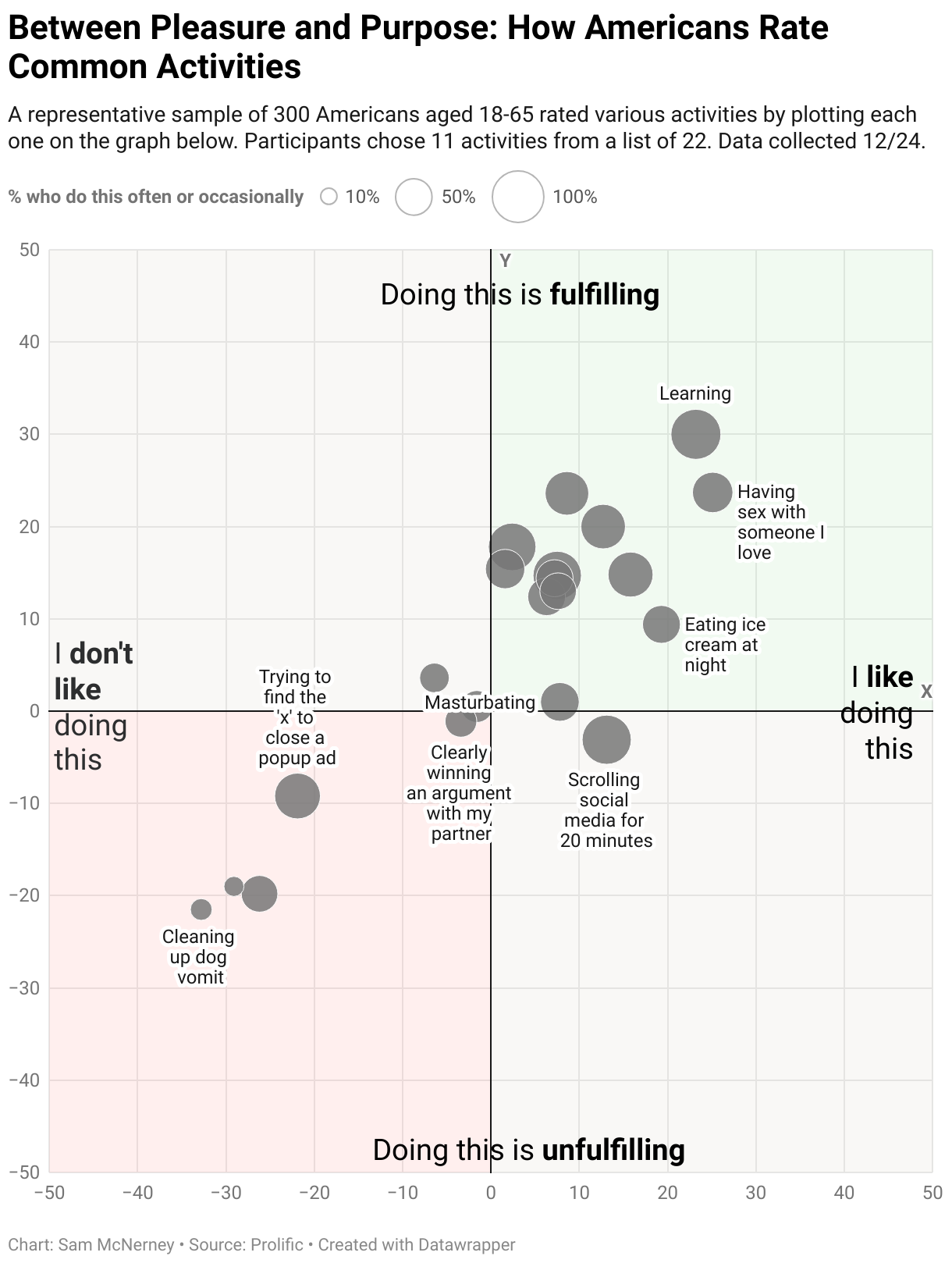
The axes are “Like-Dislike” and “Fulfilling-Not Fulling.” The top right quadrant is 'Like-Fulfilling' for rewarding activities, like going for a run, while the bottom left quadrant is 'Dislike-Unfulfilling' for stuff that’s draining, like cleaning up dog vomit.
I don’t have a scientific reason for these axes.
I picked them because I wanted to create an interface for both measuring behaviors and presenting results.
The Survey: 300 people plot their life, from “Cleaning up dog vomit” to “Reading before bed.”
In the survey, 300 U.S. shoppers aged 18-65 randomly plotted 11 behaviors from a list of 22.
"Meetings that could have been an email" ranked among the most disliked and unfulfilling activities, alongside "cleaning up dog vomit.”
“Learning” was among the most liked and fulfilling activity, on par with “Having sex with someone I love.”
You can download this chart with the data here.
You can get the graph without the data here
Both are editable. You can turn the labels on and off, or remove items entirely — whatever you need to tell your story.
(By the way, I thought “Eating ice cream at night,” “Masturbating,” and “Scrolling social media for 20 minutes” would end up in the "Like-Unfulfilling" quadrant. I guess acknowledging that you enjoy unfulfilling things is harder than I thought.)
Get the chart and get creative
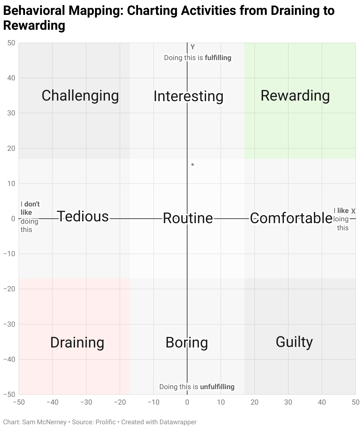
As you can see below, I took the same graph, removed the data, and labeled nine squares based on the axes.
There’s nothing scientific about how I picked the adjectives in each square.
Unlike that brand archetype slide, this graph lets you to build a story around behaviors — whether that's "brushing your teeth" or "changing a dirty diaper.” That way, you can base your brand positioning insights around how people feel and experience the category.
For example, "sitting in traffic" falls between tedious and draining, yet car brands never talk about it.
I’d put "Eating chocolate" in the "guilty" category, though that's not the first things that comes to mind for brands like Godiva or Snickers.
You can download this chart here.
One last thing
In the first chart, the link between frequency of an activity and enjoyment and fulfillment is clear: the more often you do something, the more you tend to enjoy and find value in it.
Another way to look at the same trend is to visualize the individual respondents. Click here to see how 152 respondents plotted "Having kids," color-coded by those who have kids and those who do not.
Link to the survey I used to collect the data. It’s still live.
Next Steps
If you’re considering creating a survey, but you’re unsure about your approach, then consider getting a Survey Roast.
Send me your survey draft, and for $145, I’ll make a 10-15 minute Loom video with copy-and-paste edits and suggestions.
I’d love to help.