

Product Graph Test
Imagine two jars. One is labeled “cats” and the other “dogs.” Every person drops a marble into one of the jars. By the time everyone’s done, you can see the result.
Most surveys collect answers and then turn them into charts. But the most elegant research I’ve seen works like the two jars: the data collection and the chart are the same object. No spreadsheet required.
Over the last few weeks I've been building something that does this — an interface where the data collection and the visualization happen simultaneously.
You can see it below. It’s a graph with a prompt to plot logos, phrases, products – whatever I ask respondents to plot — based on their opinion.
Survey design orthodoxy puts almost all the effort into question wording — neutrality, order effects, response options. Almost none goes into what it actually feels like to answer. That's a mistake. When you improve the experience of answering, data quality goes up.
For this week's newsletter, I used the graph to field three tests.
(One note: the respondents I recruited for these tests skew younger, and I didn’t enforce age or sex quotas, so the sample isn’t perfectly representative. I kept it loose to keep costs down — this project is mostly for fun.)
Test 1
Paul Graham’s “The Brand Age”
I recommend Paul Graham's latest essay, The Brand Age. It’s interesting.
He argues that good design converges toward the best solution while branding has to diverge from it to be distinctive. He spends most of the article on the luxury watch industry since 1960 — showing how brands like Patek Philippe stopped competing on what the product did and started competing on what owning it said.
His thesis got me thinking: what happens when the perception of product quality comes apart from the perception of why people buy something?
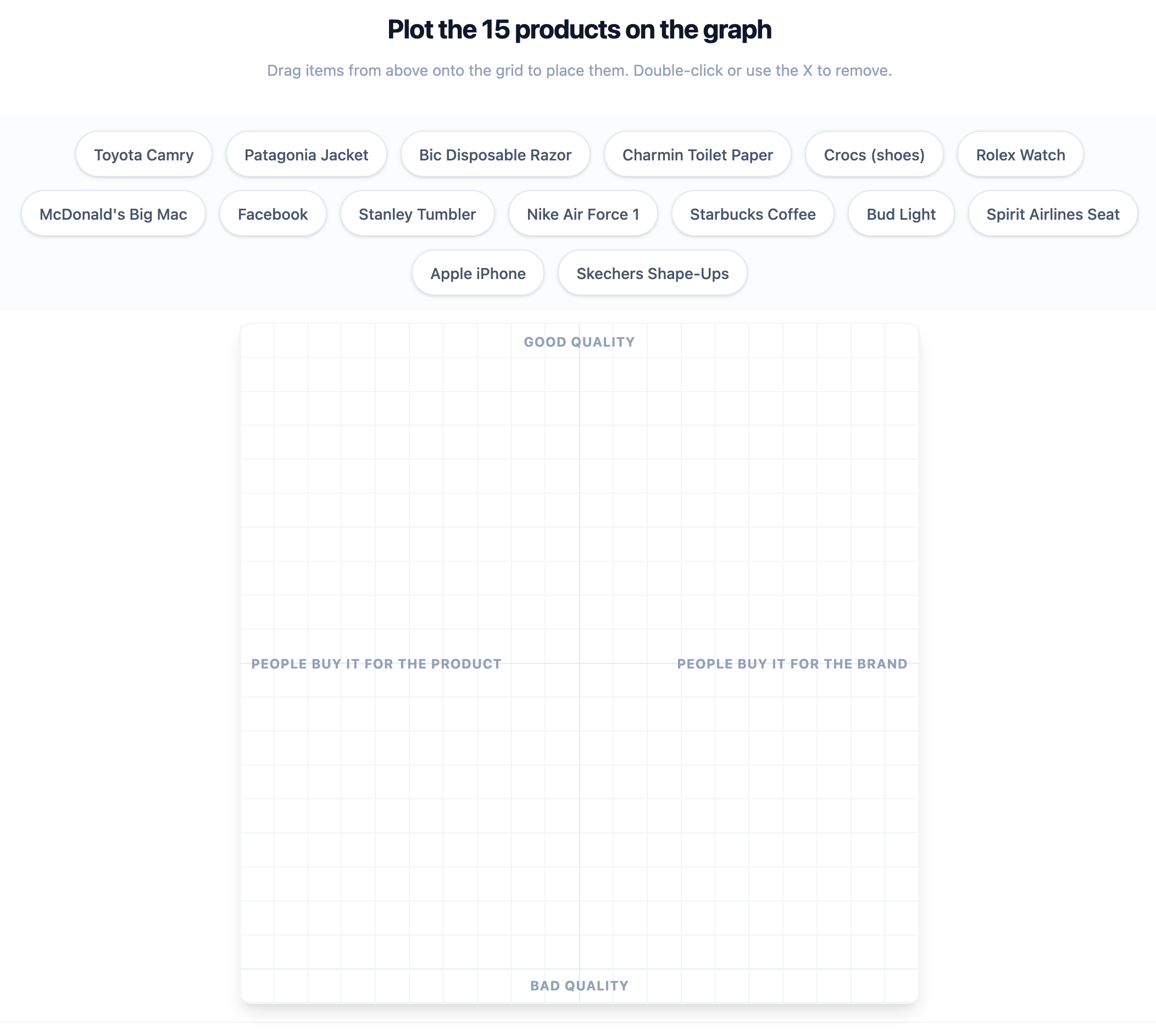
I asked 150 Americans (18+) to place fifteen products — McDonald’s Big Mac, Crocs Shoes, the Toyota Camry — on a graph with these axes:
Y-axes: Good quality ← → Bad quality
X-axis: People buy it for the product ← → People buy it for the brand.
What did I find?
Charmin toilet paper and the Toyota Camry rest squarely in the “good quality” and “people buy it for the product” quadrant, which validates Graham’s point that the best businesses are ones where people use the product because it actually works, full stop. No brand story required.


Test 2
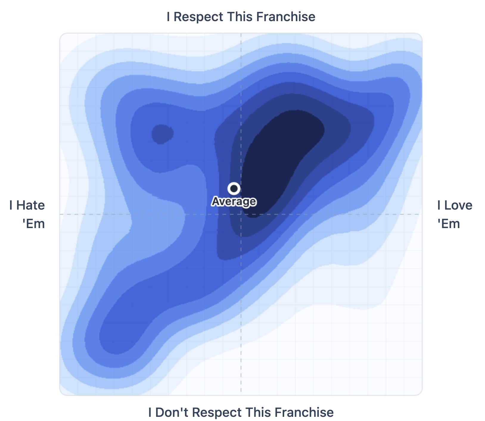
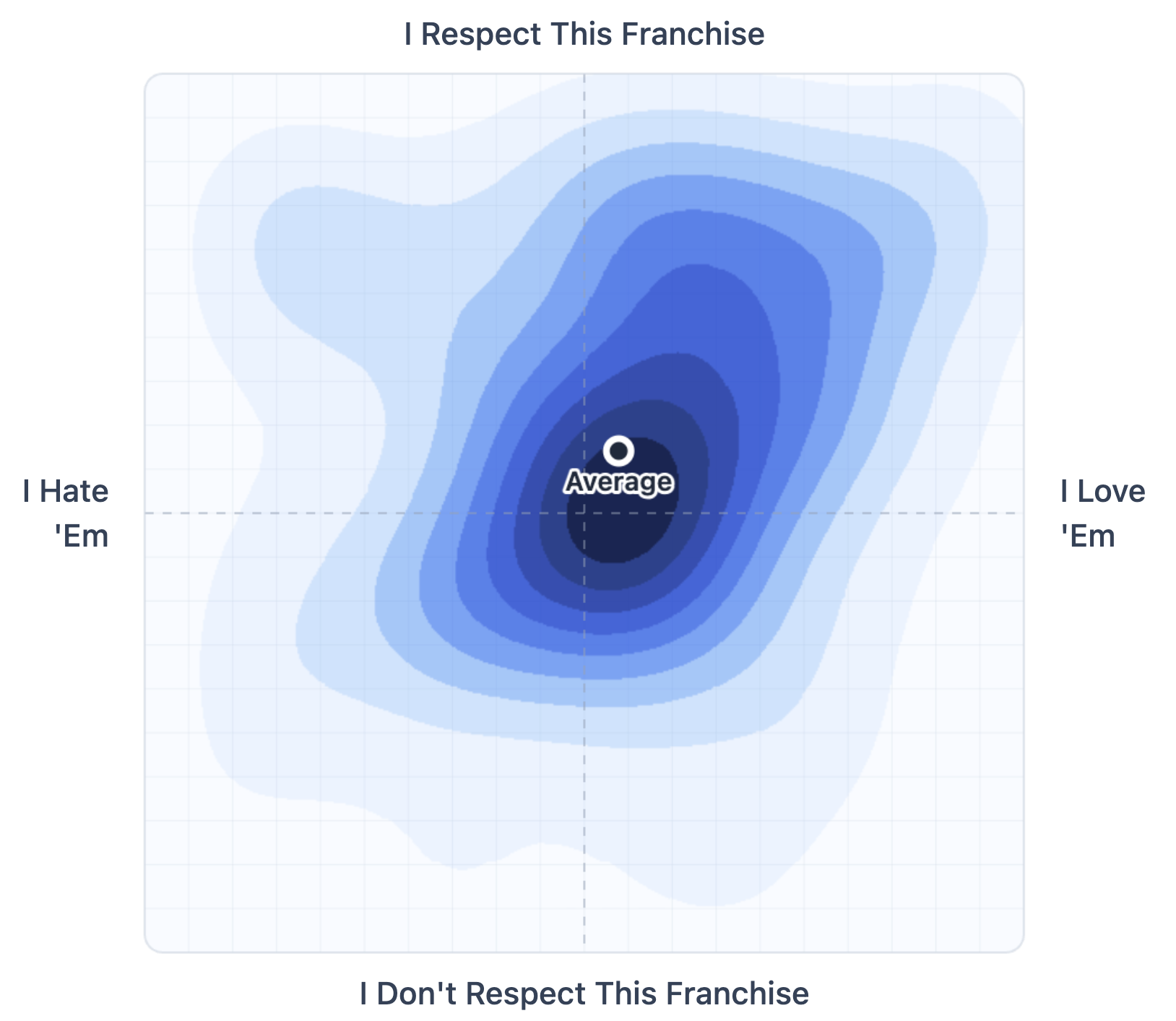
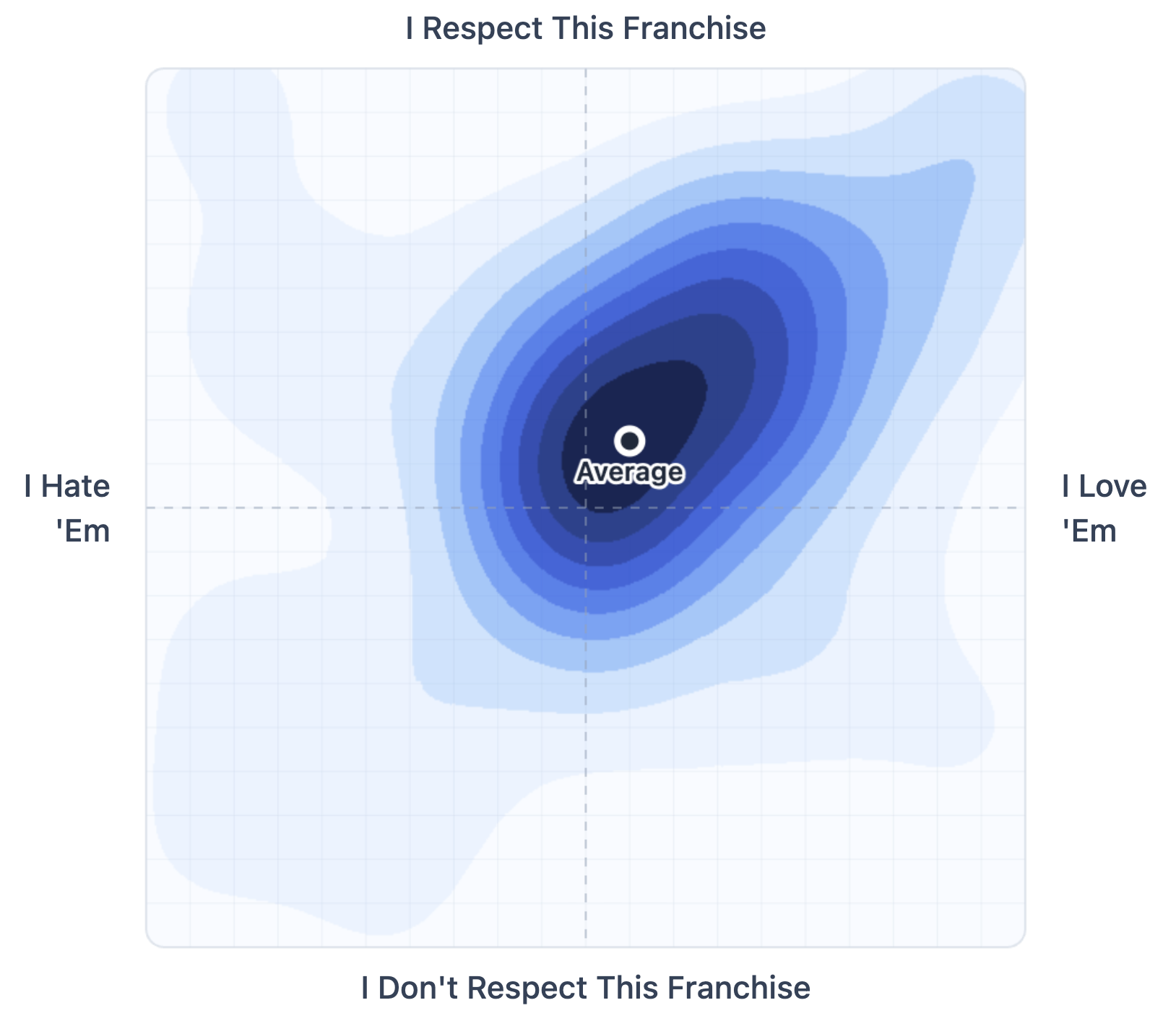
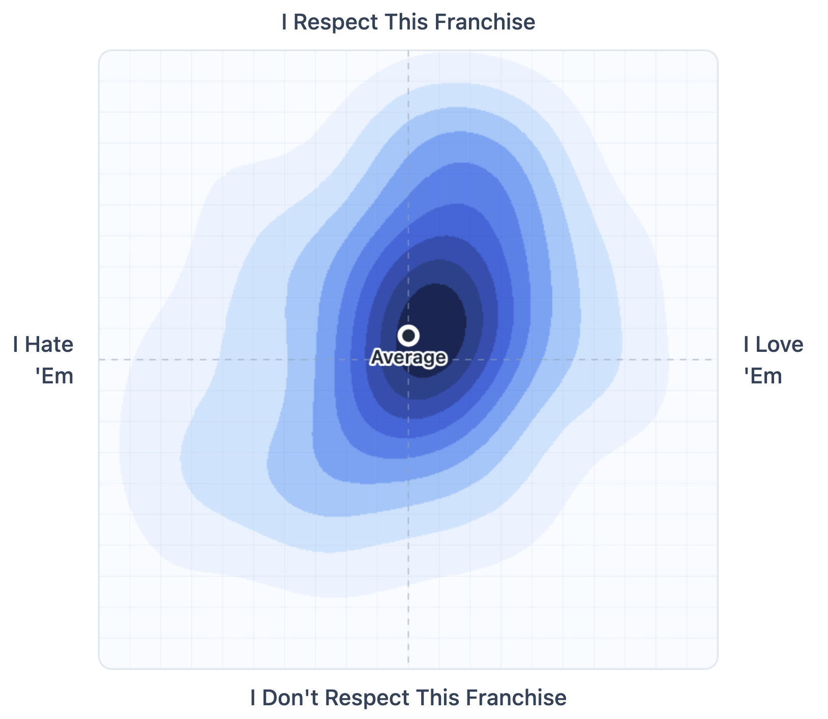
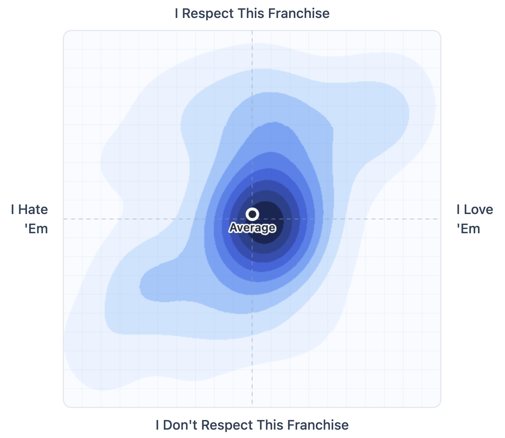
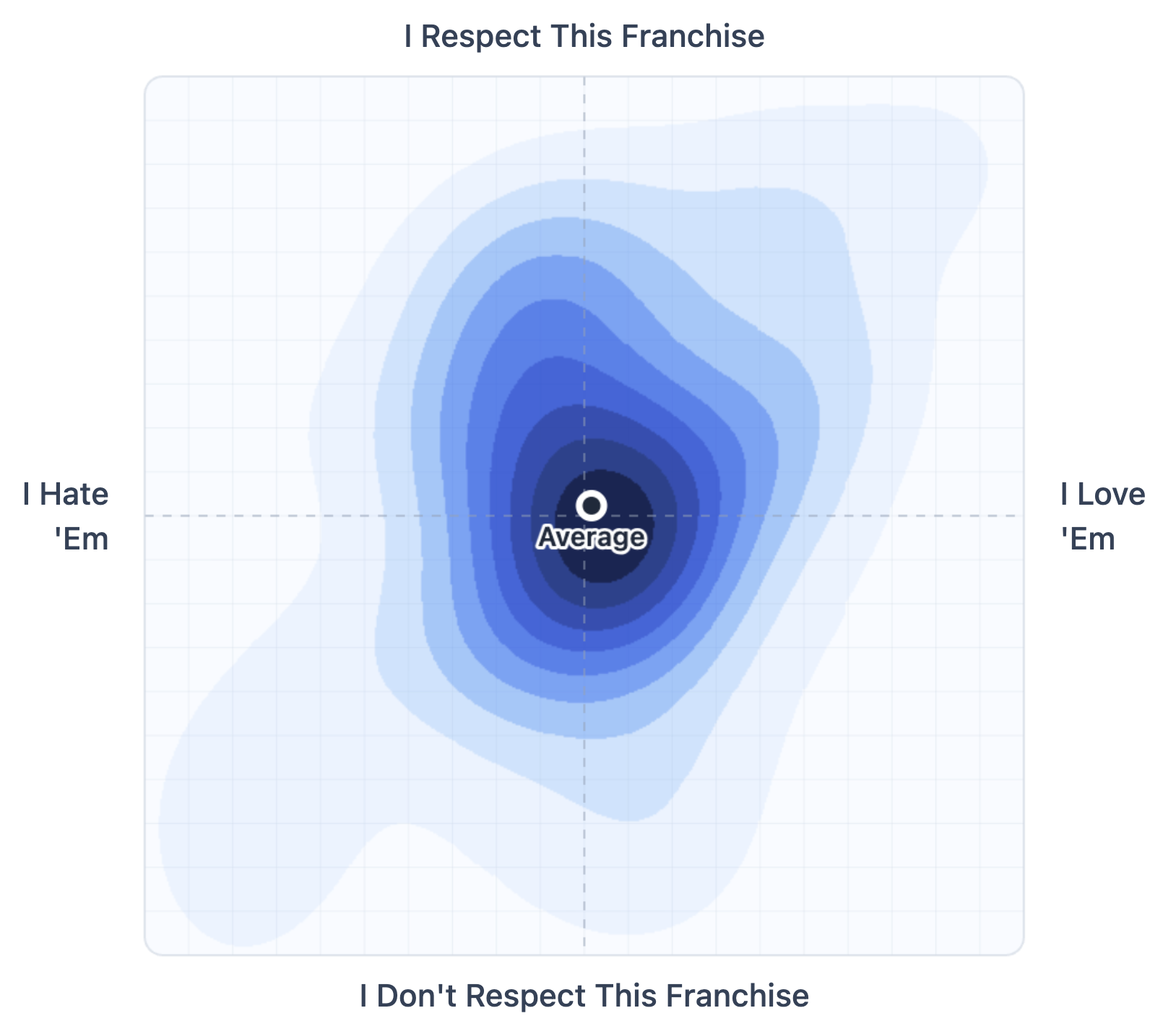
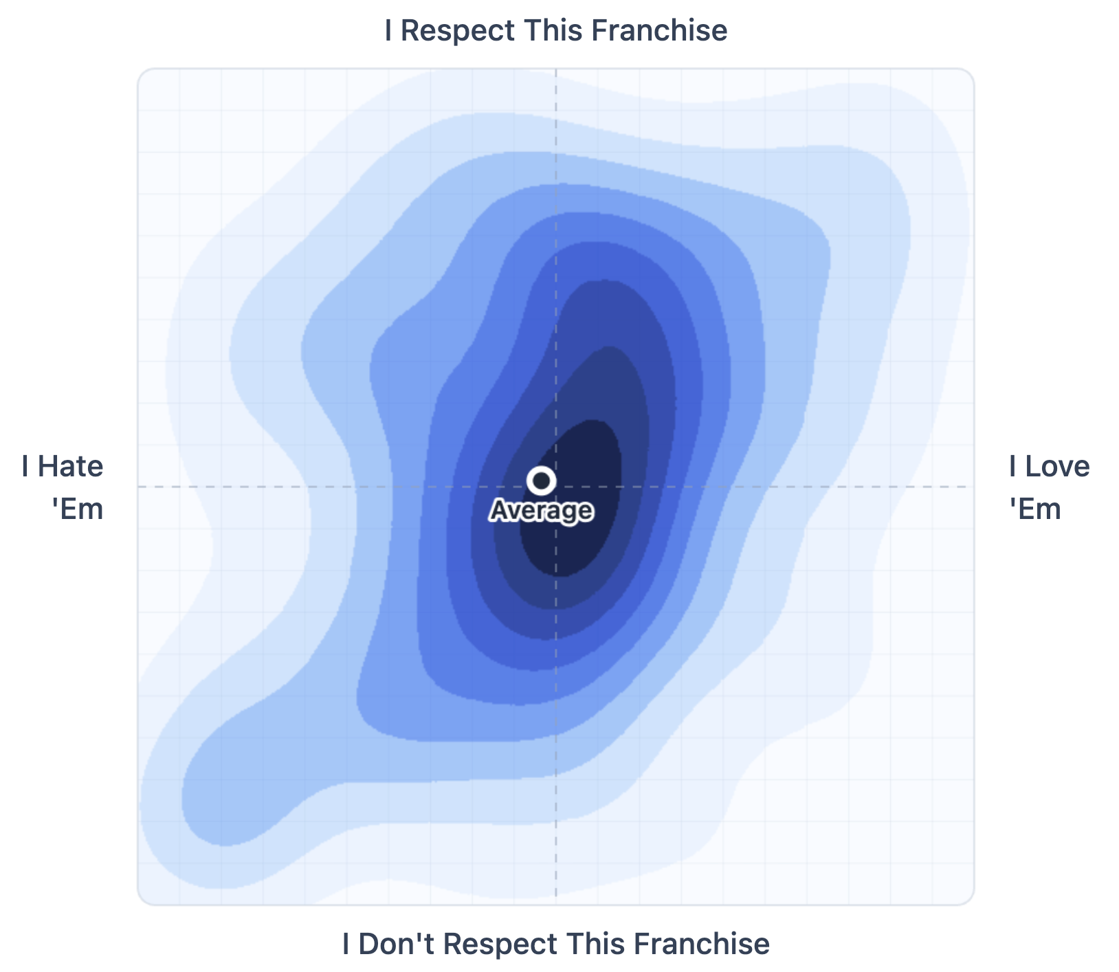
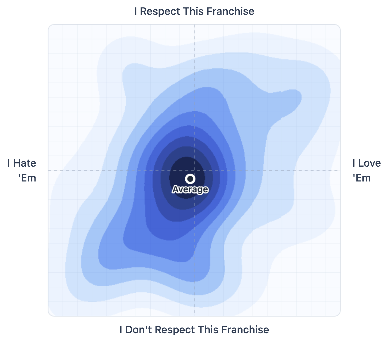
North American Sports Franchises, “Love ‘Em / Respect ‘Em”
Remember that line in Anchorman, the one Vince Vaughn says to Will Ferrell right before he saves him from the giant panda at the zoo?
“I hate you, Ron Burgundy. But damn it… I respect you.”
That’s a real category in sports. Teams you can’t stand but still admire.
There are also teams you can’t stand and don’t admire. Like the Houston Astros.
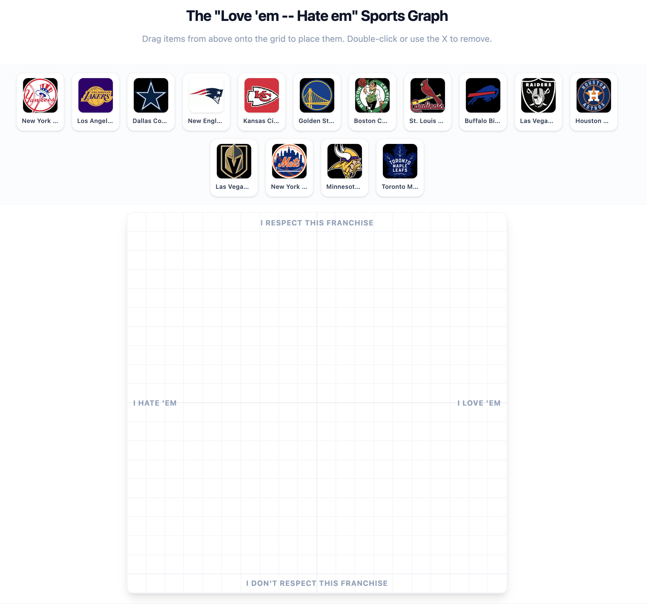
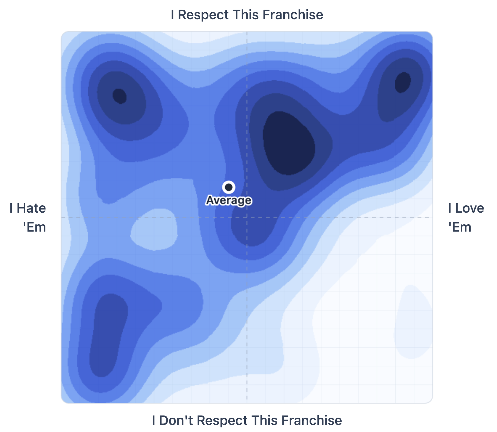
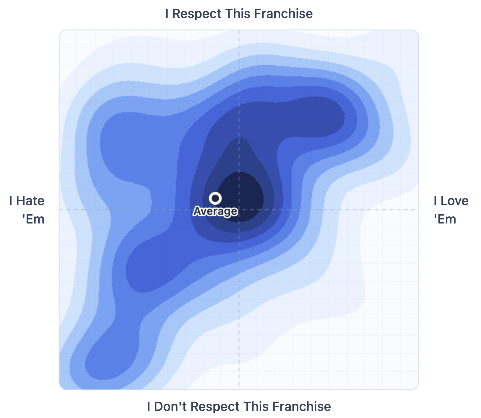
I asked another batch of 150 Americans (18+) to place fifteen sports franchises on a graph with these axes:
Y-axes: I respect this franchise ← → I don’t respect this franchise
X-axis: I hate ‘em ← → I love ‘em
You can see the landscape: villains, lovable losers, dynasties people admire but root against.
There’s also a good amount of indifference. The Maple Leafs, despite being worth nearly $5 billion, didn’t seem to ruffle anyone’s feathers.
The results also made me wonder what this would look like with a much larger sample.
Add more franchises, then break the results down by fanbase. How do Giants fans place the Patriots? Vikings fans the Packers? Mets fans the Yankees?
You’d start to see the Ron Burgundy zone — the teams people hate but, begrudgingly, respect — shift depending on who’s doing the plotting. The same map, but drawn by different tribes.


Test 3
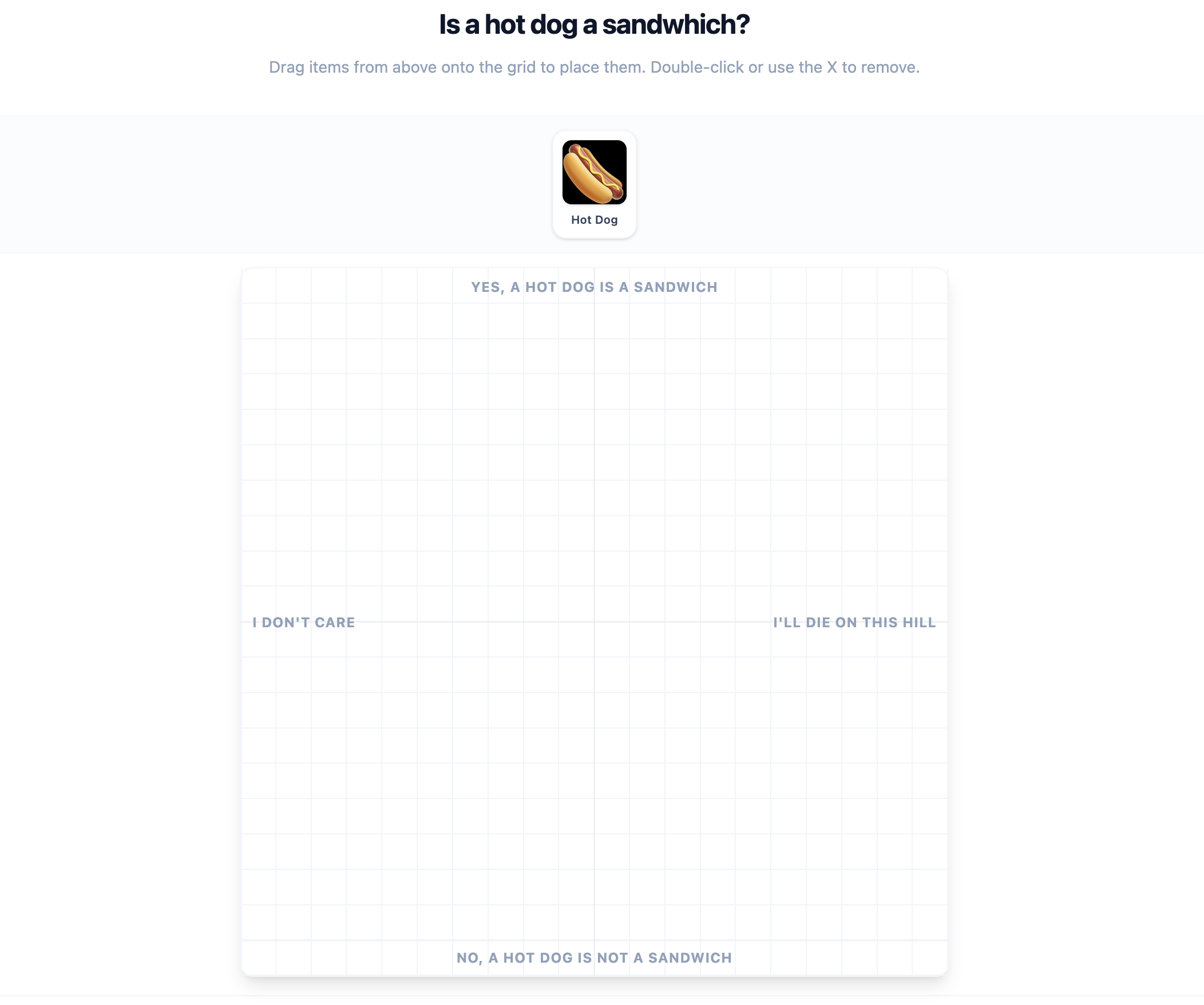
Is a hot dog a sandwich?
Like I said, very little attention goes to the experience of answering survey questions. And sometimes, improving that experience means discovering that a surprising number of people are passionate about hot dogs.
For the last test, I asked the same group of 150 Americans who plotted the sports franchise to plot a hot dog emoji on these axes:
Y-axes: Yes, a Hot Dog is a sandwich ← → No, a Hot Dog is not a sandwich
X-axis: I don’t care ← → I’ll die on this hill
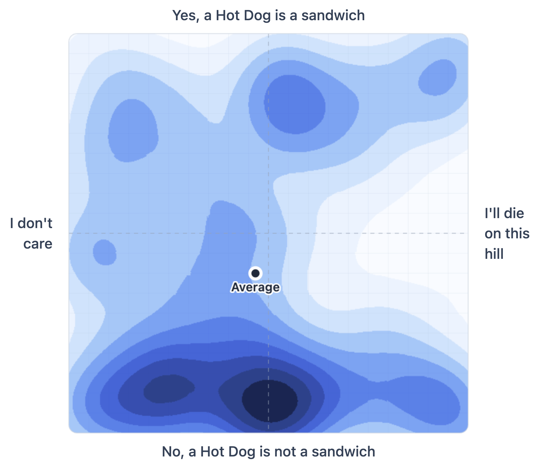
There are a few things worth pointing out here.
First, I don’t know why this is a debate — a hot dog is definitely not a sandwich. Second, the people who plotted in the top right (“Yes, a Hot Dog is a sandwich” and “I’ll die on this hill”) are freaks who need therapy.
Of course, I picked hot dogs because the interesting variable isn’t which side people take but how strongly they care about something that doesn’t matter. You could run the same format with things like “pineapple on pizza” or “Die Hard as a Christmas movie.”
People’s opinions have two dimensions. What they think and how strongly they feel. When you tease those apart, the picture gets more interesting.
How you ask shapes what you learn. A small change in format or wording can make a question easier to answer — and that usually means better data.
That’s exactly what I look for in a Survey Roast.
For $145, send me one of your survey questions. I’ll send back a 15-minute Loom and a Google Doc with copy-and-paste edits and suggestions to make it clearer, easier to answer, and more likely to produce useful data.
You can see an example here.
Cheers,
Sam