
How to present survey data: a guide for agency strategists
In the summer of 2024, I reluctantly paid $35.88 for an annual subscription to GeoGuessr—a geography trivia game where you’re dropped into a random Google Street View image and asked one simple question: Where am I?
I’ve always liked maps.
I assumed I’d poke at it for a week and move on.
But that’s not what happened.
I started playing competitively, and at first progress was slow. But I stuck with it, and over time patterns began to stick. Nine months later, I was promoted to the top division—GeoGuessr has ten divisions modeled after European soccer—where the system switches to pure ELO rankings.
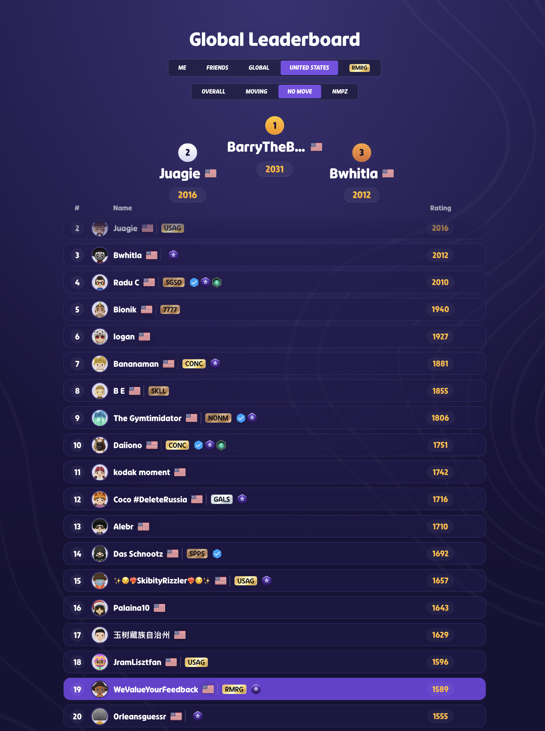
As of this winter, I’m hovering around the top 20 players in the United States in No-Move, my primary game mode.
What I love about GeoGuessr isn't just the subject matter.
It's the interface.
The game is effectively an image-based questionnaire where the input and output are the same thing: a location on a map.
Most survey research doesn't work that way. You read a question, scan a list, and click an option—then someone has to turn all those clicks into a chart and stand up and explain what it means.
The best research I've seen works like Geoguessr: the interface people answer with is the visual you use to present the results.
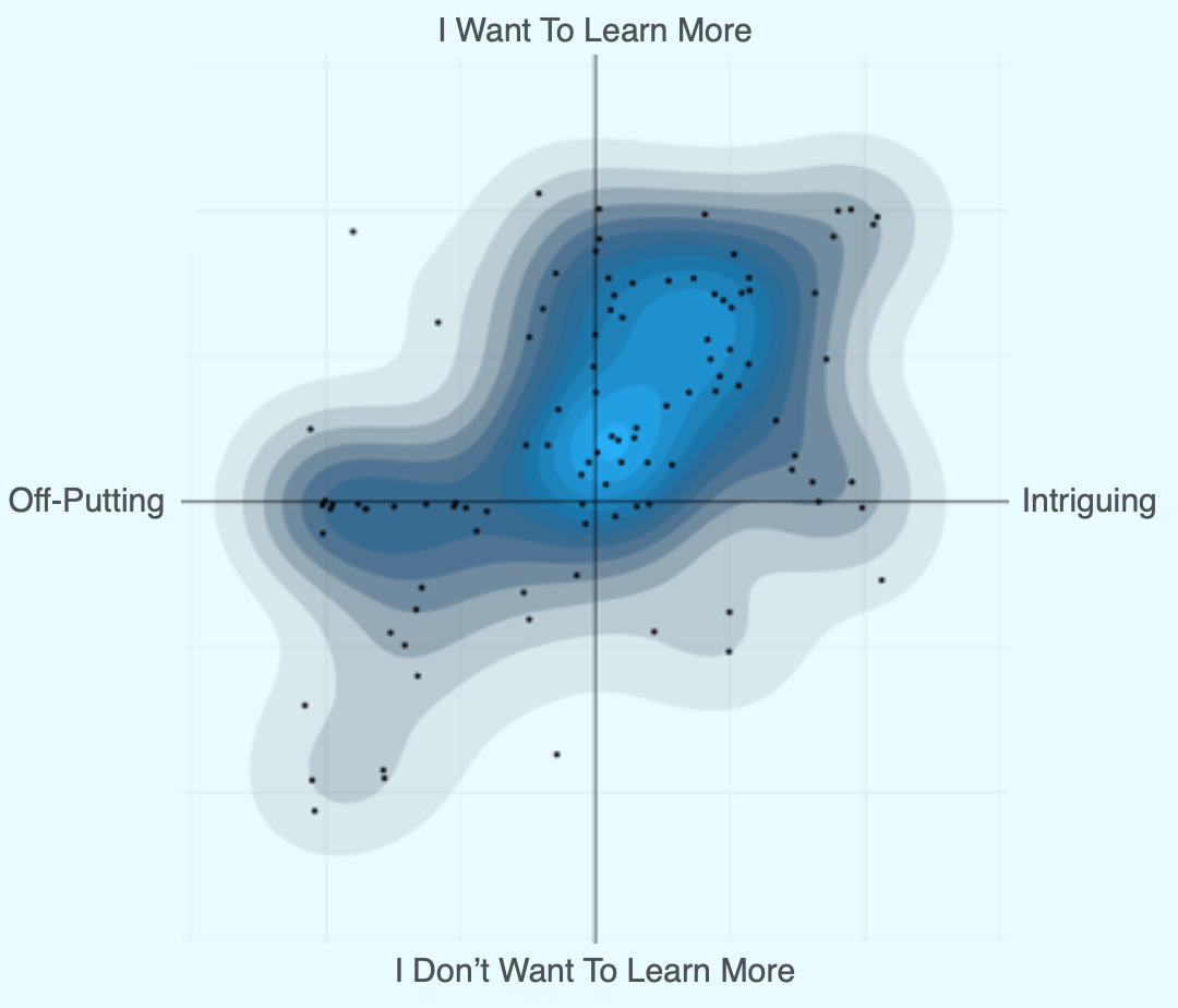
Back when I worked at Publicis, I built a methodology called Crosshares that did exactly this. Respondents plotted brands on an x-y graph, then we'd present the same graph back to clients, but with a heat map showing where each brand sat relative to the others.
We still had to connect the results to the story we were telling, but we skipped the usual methodology slog. No "respondents did this, then we ran this analysis…." The room just looked at the heatmap and got it.
Here’s an example.
For this week’s newsletter, I ran a small survey to show you what this looks like in practice, and to give you some resources you can steal for your own work.
In a survey, I asked 150 Americans to rate 22 items on a single scale.
The world needs less of this ↔ The world needs more of this
If they weren't familiar with an item, they could skip it, so everything in the chart below comes from people who actually know what they're rating.
The interface is simple — move a slider—and the output is the same scale, just showing where everyone landed.
Take a look.
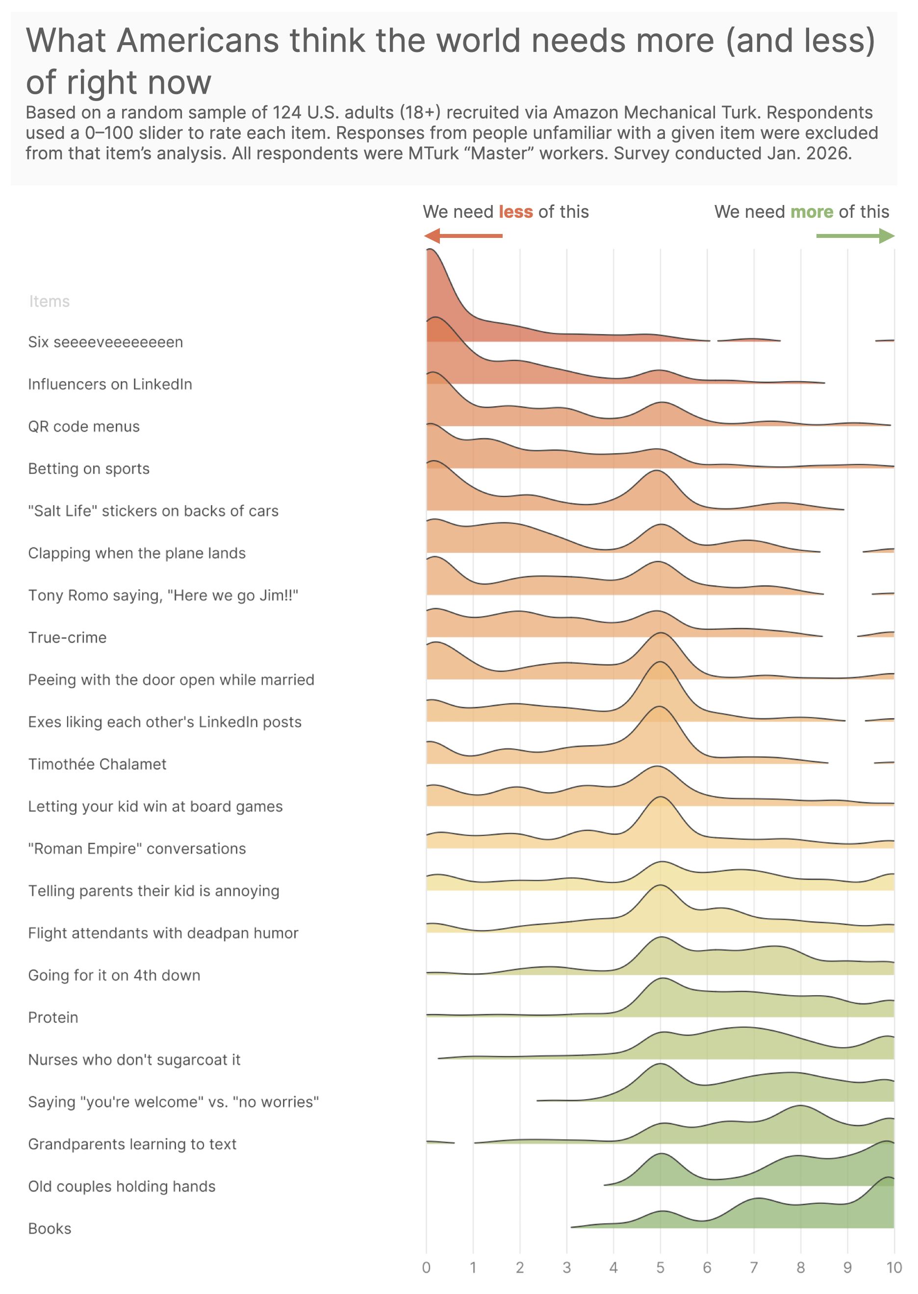
There are a few things to say here.
At the “more of this” end: books, old couples holding hands, grandparents learning to text. Humanity is still alive.
At the other end: QR code menus, LinkedIn influencers, and “SIX SEEEEVEEEEEEN.”
The middle is where it gets interesting—and dumb but in a good way. Timothée Chalamet sits in a polite cultural shrug.
If you're a strategist, you can make this your own.
The spectrum I used—"The world needs less of this / more of this"—was mostly for fun.
You can swap in any scale that fits the story you're trying to tell.
Need to map a competitive set? Try "category disruptor ↔ category leader."
Testing messaging? Try "wouldn't share ↔ would share with a friend."
The point isn't the specific spectrum. It's that your respondents and your clients are looking at the same thing.
Resources to Steal
The Survey Template. I used sliders and built it the survey in Alchemer.
The R script I used to visualize the data. It’s probably not something you can run—everyone’s data will look different—but it should be a good reference for how little machinery this actually takes.
The Data. Go nuts.
One More Thing
I spent years at Publicis learning how to build research that doesn’t need a narrator—work that can stand on its own in a room.
If you’re sitting on a survey that feels more like spreadsheet research than something people actually want to talk about, I can help. Book a Survey Roast and we’ll fix the questions before you waste time fixing your slides.
Cheers,
Sam