

How to cut your survey in half without removing a question
- The question defines the feature in text — 18 words of preamble before asking anything
- Respondents who already know Receipt Rules have to read a definition they don't need
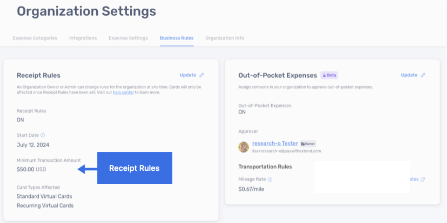
- A screenshot of the feature
- Respondents who know it recognize it instantly; those who don't can see exactly what it is
- Word count drops from 24 to 6 — zero meaning lost
Two months ago, Extend, a spend management company, asked me to create a user survey.
They wanted to know whether their users were aware of - and used - 16 different features on their platform.
That’s a lot.
But if that wasn’t enough, the description of each feature was long.
No one has time to read 16 descriptions.
This kind of survey could only mean one thing: high drop-off rates.
Luckily, I found a creative solution by playing a game I love - Geoguessr.
Geoguessr, in case you missed their Covid-era hype, is a geography trivia game where players guess locations from Google Street View imagery.
It’s really an image-based questionnaire.
Using highlighted screenshots of each feature in Extend’s platform, I created an image-only survey to measure user awareness.
Results:
✅ Reduced completion time from 10-15 minutes to 4-6.
✅ Survey completion nearing 100%.
✅ Higher quality feedback.
Tip for SaaS and B2C brands: Use visuals when you ask users/customers about a product feature.
1. Take a screenshot of the feature as it appears.
2. Highlight the feature with an arrow.
3. Embed the image to your survey.
Visuals simplify the response process.
They’re less demanding, easier to process, and work well for both physical products and digital features.
Making the survey question accurate or “methodologically sound” is important. But making the users engage with your questions is much more important.
Focus on ease of response. Let UX design principles guide your surveys.
A picture does speak a thousand words.
Need help reducing the length of your survey? Click on the link below and get a survey Roast.
I’d love to help.
Cheers,
Sam