

A survey is like a colonoscopy
Necessary.
Potentially valuable.
Everyone involved wants it to be as brief as possible.
Yet considering that longer surveys are more expensive, how people measure survey length is surprisingly primitive. Typically, an analyst will take the survey himself, consider platform-generated estimates, and then guess.
There’s a better way.
It’s a metric I track: response time per question.
This metric nudges you to treat each question as its own step, similar to how UX designers view each field in an online form. It’s not just about measuring overall time but knowing which questions you need to edit or cut.
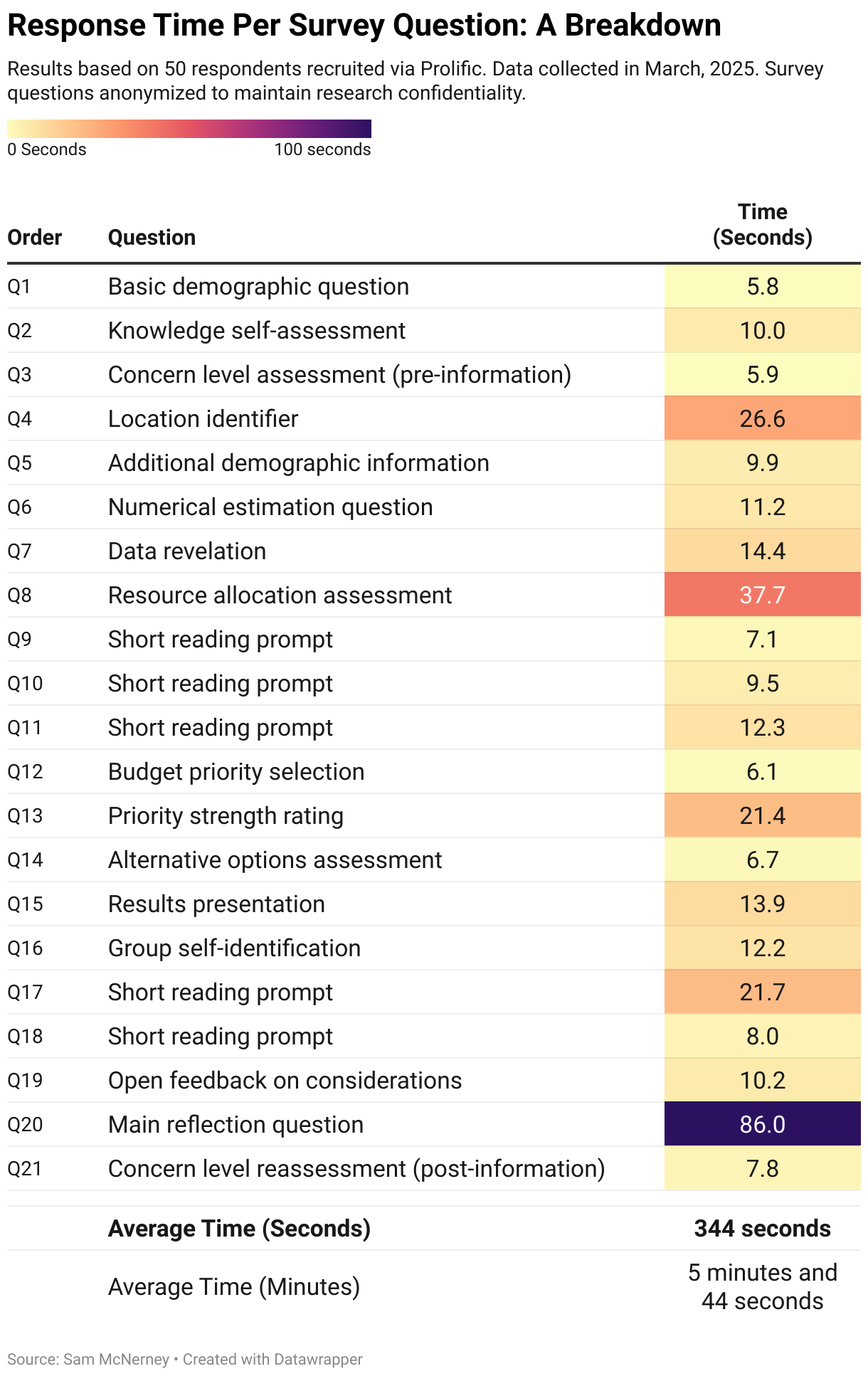
For example, last week I tested a client survey on a sample of 50 respondents.
There were 21 questions, and I embedded a hidden timer for each question that tracked response time per question in seconds. (Most survey platforms have this function. If yours doesn’t, you should be able to embed Javascript on each page).
The respondents were paid to complete the survey—which meant I focused on question clarity. If you're working with volunteers, like customers or employees, you'd likely prioritize minimizing drop-off rates instead.
After collecting the data and removing a few outliers (respondents who left survey pages open for extended periods), I visualized the results in the table below.
There’s a few interesting things in this data.
You might assume Question 20's massive 86-second average is a disaster, but Q20 was an open-end, and the most important question in the survey. I was thrilled respondents spent more time there.
Question 8's nearly 38-second average might look bad but I asked people to do some quick math. I wasn’t surprising it took longer. (This question also provided insightful data, so making people think a bit harder was worth it.)
The red flag was Question 4.
I asked respondents to select their county (this survey targeted a single state with 200+ counties), and people clearly struggled with the dropdown menu. Nobody should waste 25 seconds scanning a list. When I looked closer, I realized the counties were grouped alphabetically by region, so respondents had to first find their region and then scan within it. I fixed it by simply putting all counties in a single alphabetical list.
Question 17 was another problem. 21.7 seconds felt too high. When I reread the question, I realized that I'd written a paragraph when a sentence would do.
Since I'm running another test this week that will also measure response time per question, I’ll know whether my edits actually solve these problems or not.
You can overlay this analysis with question-by-question drop-off rates (if you're using volunteer respondents) to identify exactly where people are leaving your survey—something total completion time or overall drop-off rates could never provide.
If you’re using paid respondents, shorter surveys not only improve response quality but also save money. Trimming just one or two minutes from a large-scale survey could easily save you thousands of dollars in respondent fees.
Response time per question is one of the many techniques I mention in my Survey Roasts.
If you're working on a survey, and you’re worried that taking it will feel worse than getting a long tube shoved into your rectum, consider booking one.
Send me your survey draft, and for $145, I'll make a 15-minute Loom video with copy-and-paste edits and suggestions to improve your survey data quality.
Cheers,
Sam
Steal-This Resources
• The Data Visualization (you can download and edit with a free DataWrapper account)